I would like to submit a request for a feature improvement – as you can see below, nearly each step in the Process tab is truncated, making it very difficult to fully understand what is involved with each step – there is so much dead space to the right that could be utilized rather than truncating to such a small portion of the screen. I recommend working on the GUI so that it is dynamic to the screen resolution of the user, filling the space that is available.
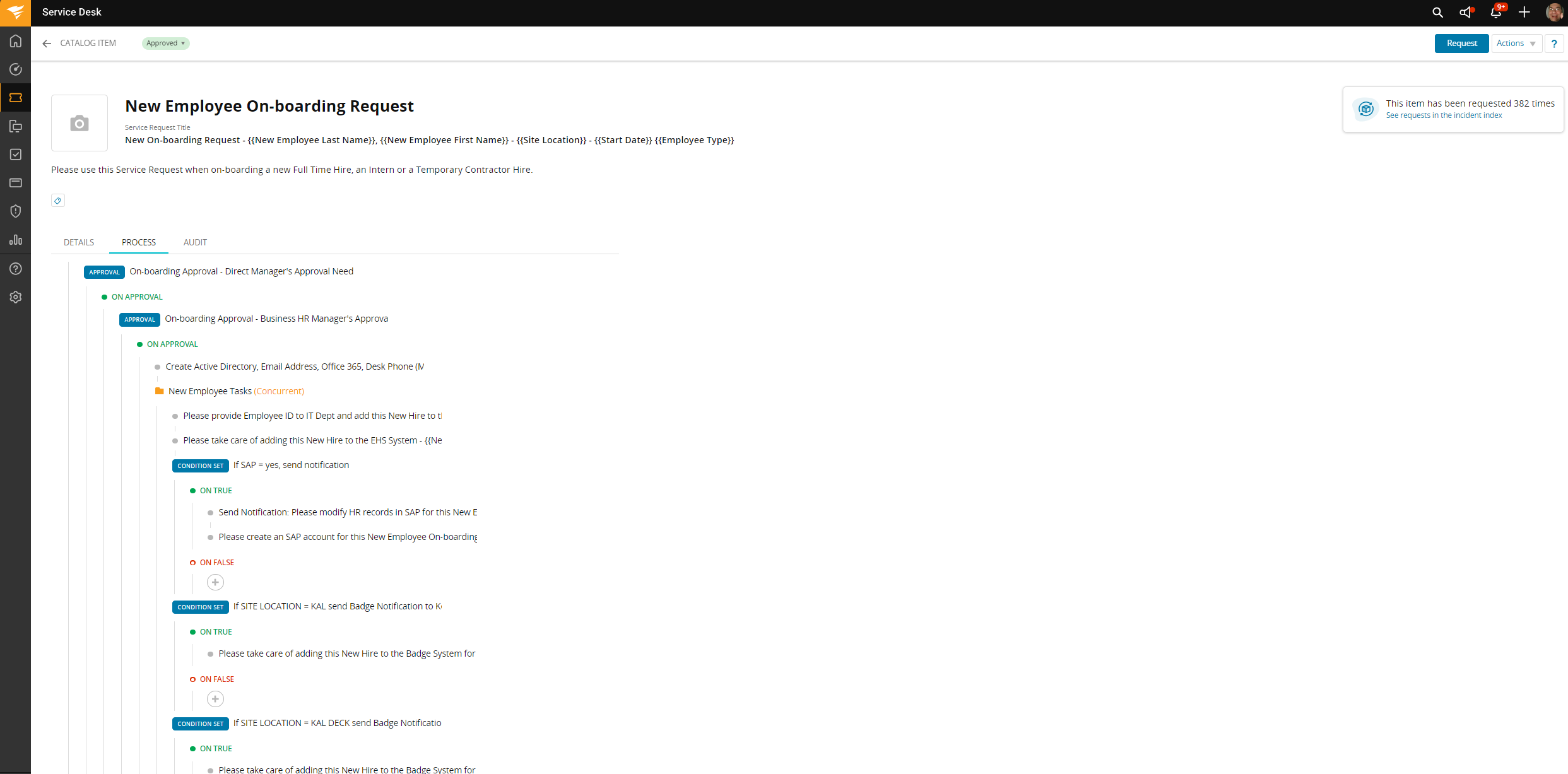
Additionally, if each step had an option to expand them so that you can see the details for each step, then your recommendation to print the page would be far more useful. Unfortunately, printing this page just results in the same unusable information. We cannot get an overall view of the process – we have to drill down into each step and invoke the editing process in order to see what each step entails. That makes it very challenging for other departments, that may not have Agent status, to review and provide recommendations as to any changes that need to be made in order to meet their process workflow.
So, my first recommendation – expand the GUI to fill the screen.
My second recommendation – make it possible to expand each step so that all of the details associated with each step is easily visible.
Or, my third recommendation – forget all of the above and make it possible to export all of that data into an easily viewable expanded list view. Then you won’t have to mess with the GUI at all.
