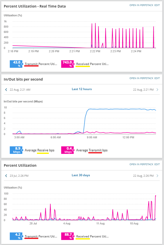
We are looking for more consistent color's in the widgets that represent similar data. We have specifically noticed this as a problem on the default Interface Summary page for all of our nodes.
We at this time are seeing the transmit and receive colors on the charts in the default interface summary as different per chart. Sometimes the transmit is red, and the receive is blue. Sometimes the colors are reversed depending on the widget. (Screenshot of this below)
This makes utilizing these charts for troubleshooting purposes more challenging as we have to mentally separate the data from their colors.
For the feature request, we are looking for the various widgets to have their color mappings for transmit and receive traffic synchronized so that all transmit data is one color, and all receive data be another color when viewing the page.