Trying to create a report that will show my average bandwidth utilization, and the min/max utilization. For some reason my average line is below the min/max bars. This doesn't make much sense - I would expect the max on the max bar to be higher than the average.
I would really like to have the report show the peaks vs the averages - but this doesn't seem to be working for me. Can anyone here on Thwack help to answer the question - how do I create a report for an interface that shows the average utilization and the peaks?
Here is how I created my current iteration of the report:
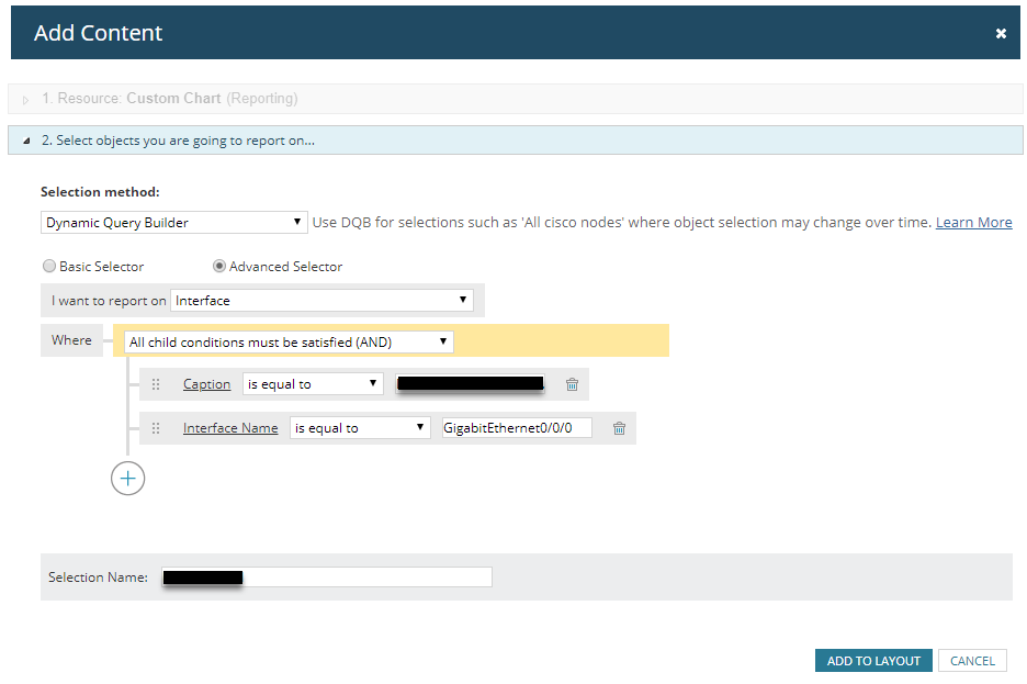
1. Go into Report and create a custom chart:
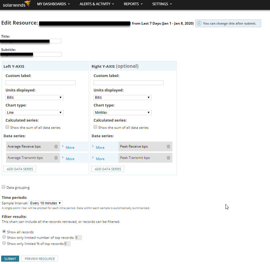
2. From there, edit the resource to show the Average Receive and Transmit as a Line chart, and the Peak Receive and Transmit as Min/Max bars:
3. Then when Clicking Preview Resource this is what I see:
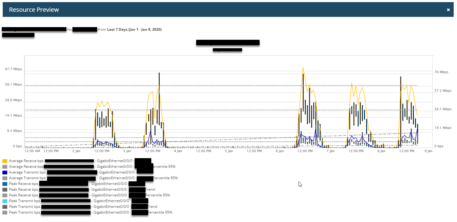
As you can see - the min/max bars are almost always lower than the average receive bars.
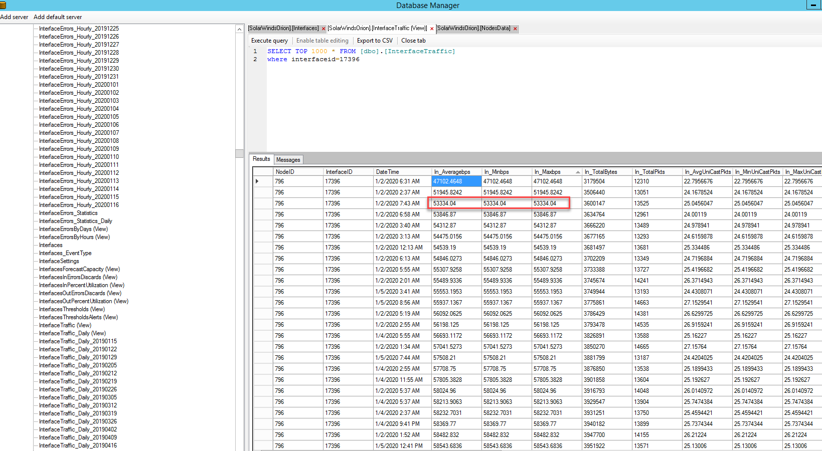
Upon further investigation the Database Manager is showing that the Average/Min/Max for the interface ID is all identical. Is this correct?