Hey guys!
I was wondering who out there has had success in creating crisp custom icons to use in Network Atlas and what were the document settings used.
I've been tasked on my team to start creating custom icons for our maps and redrawing the maps. I've created a series of custom icons using Adobe Illustrator, but when I export them to a .wmf file to use in Network Atlas, then the icons look incredibly fuzzy. Some look better than others, but I was looking for any advice so I can be consistent with these.
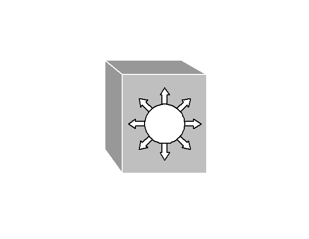
Below is one of the icons in question.
Thanks!
