Hello,
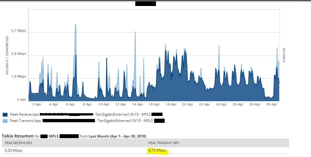
We have this issue where the peak transmit/recevie graphics information does not match the peak Transmit/receive Table information.
I've tried many things but still The same.
Have anyone seen this before?
NPM12.0.
Thanks for your help.
That looks like a report, if you can share your break down it would make it a little easier.
Off the top though I would say check the graph details for what time frame your data points are set display on (5,10,15, 30, 60 minutes). The graph will average out multiple data points within whatever time frame you have set, so if you set your detail to 10 minutes (which is 1 minute more than the default interface statistics interval of 9 minutes) you will see more accurate points on the graph. Depending on the data (if there is a quick hard spike) two values of a massive difference can still be averaged - killing the peaks and valleys in some cases.
You might try a 5 minute timing display on the graph, and that might give you a few more accurate points. Again, depending on the data this has potential to create a 'spotty' graph where it looks like there are holes in your data. Kick back with some details if you don't help in this information.
-CharlesH
Loop1 Systems: SolarWinds Training and Professional Services
When your charts have data intervals that aren't the same as the polling interval it averages them for the web display, this can be misleading for things like charting min/max values unfortunately.
If you made the chart into something like a 24 hour chart with 10 minute intervals you would probably get something that more closely matches the data.
I'm not aware of any setting that would change the way that behavior works in the default charts.
I submitted this last Friday, weird.
cahunt,
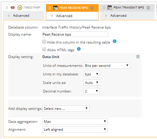
Thanks for you answer, I use Custom chart and custom table.
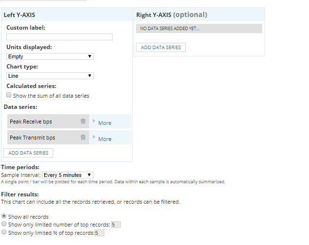
Custom chart is set to 5 min, the same as the polling interval, at the end are the config for the chart and the table.
Both used with the same interface.
Table
Chart: Here even when I change the Chart Type the values change a lot.
Okay, setup looks pretty good. On the left axis, I would choose the left Y axis choose the bps for you unit displayed.
Your data has commas from what I can see. Not sure if that is separating values or just your readout.
I would remove one data set and see if he graphs show correctly.
But now I see you are trying to pull details for the entire month. Unless you change your detailed retention from the 7 days default, anything past 7 days will be massively averaged.
Cahunt,
I tested with only the Transmit and still the same, the coma It's part of the value.
How do I change the detailed retention?
I just tried With the Max/Min/Average Traffic report from Orion and the data is show correctly, It does match with the Peak transmit and receive, but It does not have so much customization options, like change the graphic style.