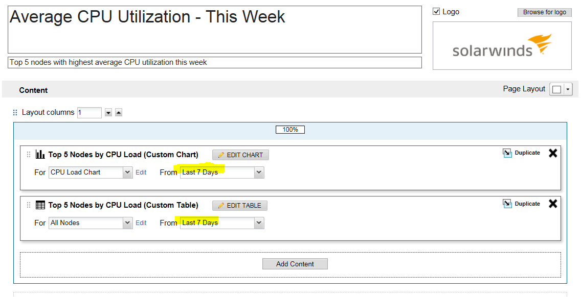
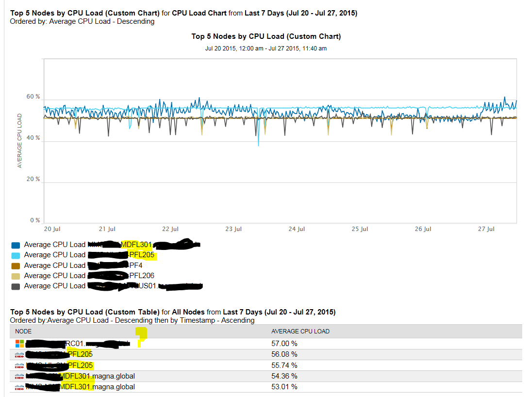
I took the existing 'Average CPU Utilization - This Week' report, that works fine. I copied it, and modified from 'Last Week' to 'Last 7 Days', and get goofy results. When I run the report, the Graph portion (Custom Chart) appears to work correctly showing the top 5 nodes CPU average graphed for the last 7 days, but I get unexpected results for the Average CPU load percentages below the graph. Its showing 5 entries, but what appears to be duplicate node names showing different averages, and a node entered, that's not present in the graph above?!? I had similar goofy results when I specifically selected 5 'static' nodes, where the 'Average CPU load percentages' are showing duplicate node names with different percentages. I assume this is a bug and not a something I need to edit update in report in how I'm parsing this?!