I've been instructed to design a report for a regional uptime chart that breaks down our AMER/EMEA/APAC areas into 3 separate lines showing uptime percentages based on a 100% scale. Can someone help me figure out where to start here?
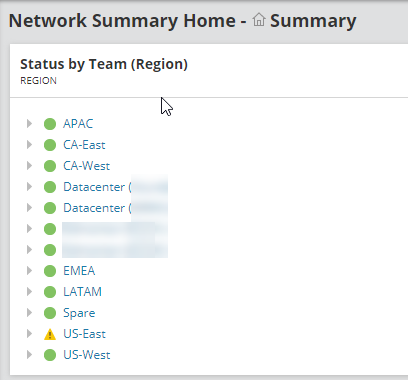
Make sure you have a custom property that tags which nodes belong in each region. I'll call mine "Region" for example's sake.
Add a custom chart widget to a view, probably want to filter it to nodes where region is not blank.
On the section where it wants to know what stats you need to track find the node availability %
In the lower section where it says group by and legend shows just set them both to use your Region custom property.
Done.
I do the same approach as Mesverrum.. I have custom properties for Region, Country, and City to help organize my roughly 365+ locations. Then you can use those properties to generate all sorts of views and reports, etc..