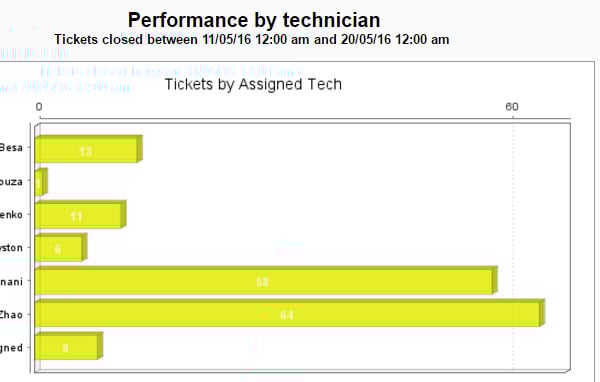
HI , All of a sudden my regular report on throughput by tech has turned yellow, How is the colour set in charts? I cant see a way to change it?
Please help - its hurting my eyes.......O.O
You can not change it. It is an automated process.
Even we have the same issue, suddenly your dashboard and reports will change into some weird combination of colors.
We can just hope it will get fixed in next update.
You gotta wear shades
As pointed by chinmaychavan we have been waiting for a fix for these. Feature requests have been raised but in the current releases there is no way to change the chart colors. A Dashboard & Reporting solution should have this capability.
This is very frustrating indeed.We have deployed two external solutions to address the lack of customization in the reporting:
1.) Excel Dashboards updated via ODBC
2.) Tableau Desktop updated directly through MySQL
Extending your reporting through either (or both!) of these options will provide you with any customization that your clients may request.Good luck!
Hi Elee,
Even we are creating our required reports in Tableau.
It serves all the requirements of our customer exactly as they required.
SolarWinds needs to improve a lot on their Dashboards.
You try to change it to pie chart that is blue and easier on the eyes. Just a suggestion I don' t like this response either.
Hi - I am looking to start using Tableau to build dashboards. Can you let me know how you setup the Data Connection? I tried MySQL with our orionmonitor web location as the server but no luck. Thanks!