Dear SolarWinds,
I think I saw this request in the past, but I could not find it. We really like the old Network Atlas link utilization and we would like to have the option to use it in new Orion Maps.
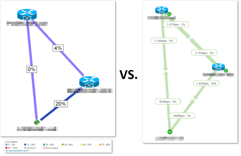
Currently Orion Maps can change the color of the link only when it reaches a threshold, which is very limiting (only two thresholds/colors - Warning, Critical). Those thresholds are only for showing potential network issues.
We miss the ability to see network utilization on a daily basis, where the colors have 0%-100% spectrum. This can show us better on how the links are behaving.
You can see on the below example that maybe Orion Maps is nicer, but Network Atlas is more readable for a quick look on the NOC view.
jblankjblank Maybe you could take a look? Thanks
Kind regards,
Marcin.