some feature request
1- change KPI color base on value (number of vocabulary) or Status code.
2- add more visual effect specialy for timeseries model.
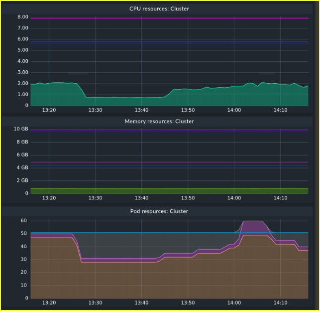
3- enable to add fix or dynamic baseline line on charts
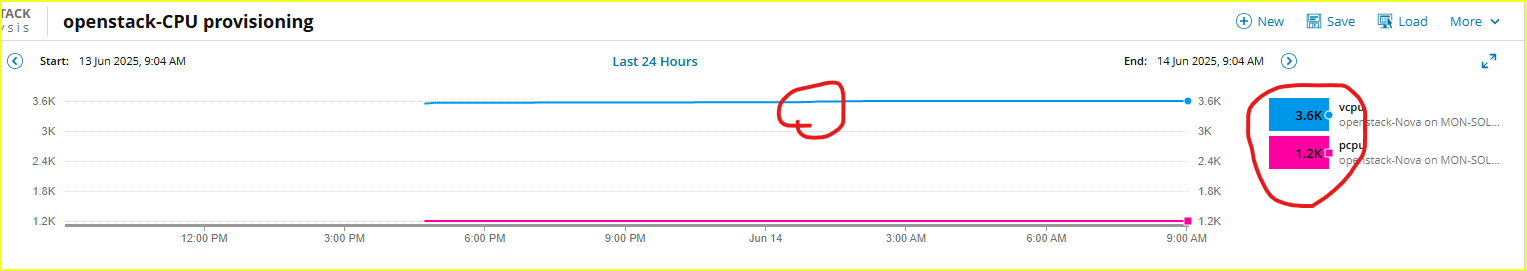
4- Enable users to customize the value display on the chart. For instance, I want to view the full numbers, as my changes are minor and not easily noticeable on the chart or in the displayed values.