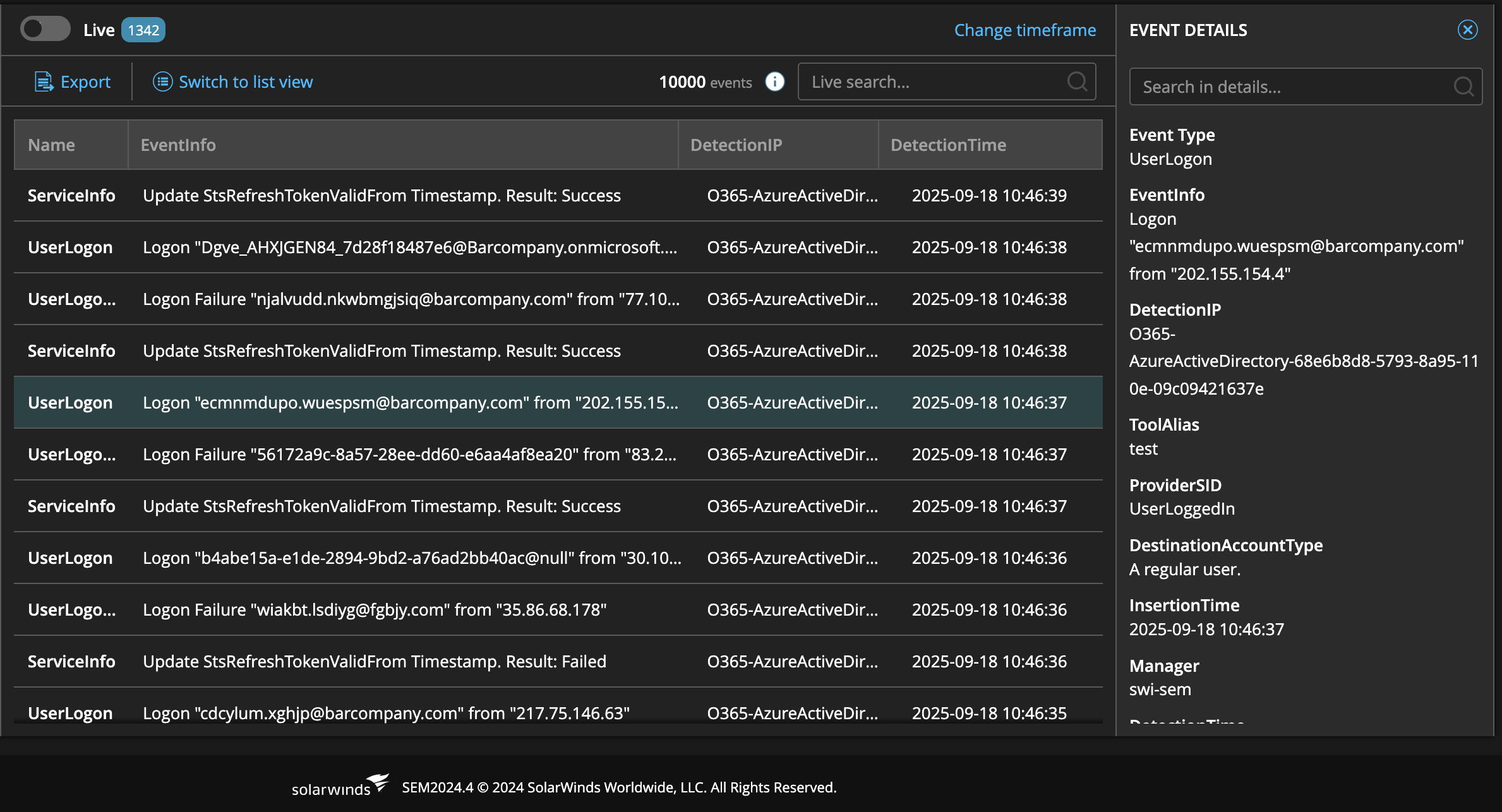
At the moment, the Event Details panel on the Live Events page is quite basic: it’s fixed to the right side, cannot be resized, and offers no fullscreen option. For larger or more complex events this makes it difficult to review all the information, especially when JSON payloads are involved. The current layout (bold label + plain text) works for small events, but becomes hard to navigate when dealing with lots of fields or nested data.
A useful improvement would be to:
Add a fullscreen mode so the details can take up the whole screen when needed.
Allow the panel to be resized when docked, with the size remembered between sessions.
Enhance the presentation of structured data such as JSON: pretty-print it, use collapsible sections, and maybe even apply a monospace font for easier scanning.
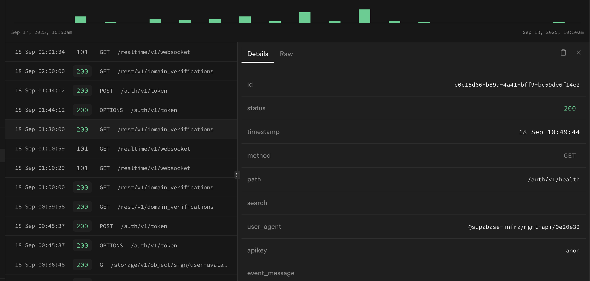
Styling the details in a way similar to modern log viewers (like from Wazuh or Supabase’s UI, reference below) would greatly improve readability. With these changes, analysts could move faster through event triage, spot issues more easily, and work with large payloads without feeling restricted by the current fixed panel.

