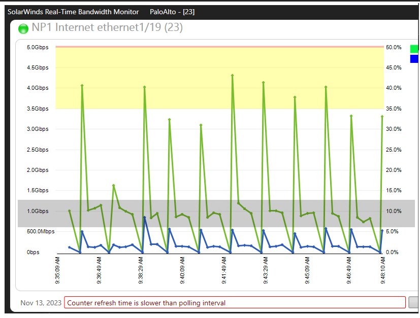
I use the Real-Time Bandwidth monitor and love it, but on some interfaces, it gives me pretty ugly graphs. Below, for instance, is the port on my Palo Alto that has my internet link. Currently the traffic is in the grey area. So, why does it have the continuous data points at zero, followed by a huge spike, then either two or three accurate data points, then repeat?
Is there a way I can get it to not show those spikes up and down?