I love how nice Network Atlas is when creating maps that create a ton of value for management. But the interface is killing me, as is inconsistencies in how it displays in the editor vs. the map resource.
As an example, I am creating a map which shows a server environment for a very important application. I am trying to align the header labels to the left along with the server icons. Here's what the screen looks like:
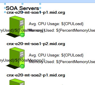
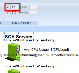
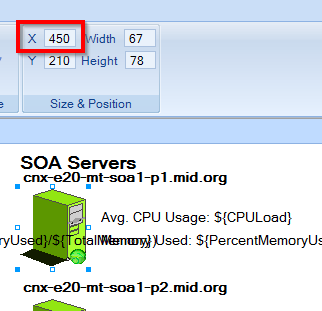
You can see the label selected that I'm trying to align. It actually seems quite close to the icon, and when I select the icon, they look pretty darn aligned. Checking the X axis numbers (note that everything in the drawing is set to Left Align) shows a discrepancy:
And this is what is displayed on the map resource:
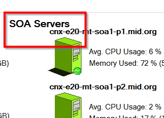
Nowhere NEAR aligned. If I match the numbers, it's even worse. Making the label match the icon (both 450) shoves the label even further to the right. Why is there such a discrepancy?
Please note, I've already gone into the properties of all the labels and all the icons and verified the justify is set to Left for everything. Thanks!
-Chris