I don't have a lot of expertise around SWQL and not sure if what I would like is possible.
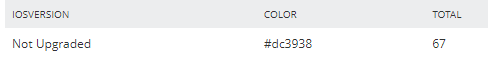
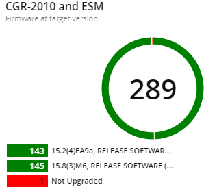
I use the query below which reports back devices of a specific machine type that match the target software version and those that do not. What I am wanting to do now is make it easier to see the counts of upgraded versus not upgraded. I would like to use a green background or red background or font colour etc. to differentiate the two counts.
Additionally, I would love to see the counts compared in a pie graph or bar chart or other visual representation to showcase where we are when in the midst of a large upgrade process being managed by Solarwinds.
Is this possible with the custom SWQL widget?
Any recommendations on how to achieve this would be greatly appreciated. My only limitation is I can't open up any security risks.
SELECT dd.MachineType AS [Device Type]
	,'/NetPerfMon/images/Vendors/' + dd.Icon AS [_IconFor_Device Type]
	,dd.IOSVersion
	,COUNT(dd.IOSVersion) AS Total
FROM (
	SELECT n.Caption AS Device
		,n.Icon
		,REPLACE(CASE
				WHEN n.HardwareHealthInfos.Model = ''
					THEN n.MachineType
				ELSE ISNULL(n.HardwareHealthInfos.Model, n.MachineType)
				END, 'Cisco Catalyst ', '') AS Model
		,n.MachineType
		,CASE
			WHEN n.IOSVersion NOT IN ('target software version')
				THEN 'Not Upgraded'
			ELSE n.IOSVersion
			END AS IOSVersion
	FROM Orion.Nodes n
	WHERE Status != '9'
		AND n.MachineType IN (
			'Cisco IE-4000-4GS8GP4G-E Industrial Ethernet Switch'
			,'Cisco IE-4010-16S12P Industrial Ethernet Switch'
			,'Cisco IE-4010-4S24P Industrial Ethernet Switch'
			,'IE-4000-4T4P4G-E'
			)
	) dd
GROUP BY dd.MachineType
	,dd.Icon
	,dd.IOSVersion
ORDER BY dd.IOSVersion