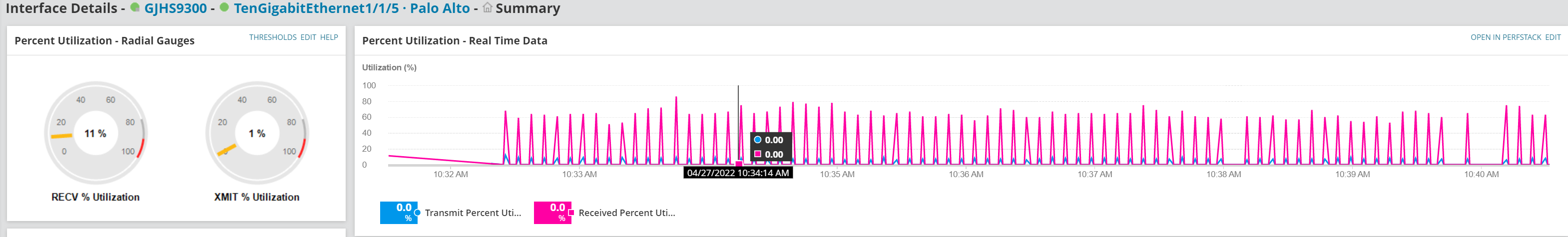
I have a question about the graphs when I'm monitoring an interface. Below is an example. This is the interface on at Cisco 9300 that is receiving all my internet traffic from my Palo Alto firewall.
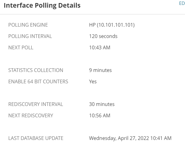
The radial gauges stay steady and accurate. The Real Time Data chart, however, constantly bounces up and down and don't depict the steady traffic flow, which is what I'd like to see. I also know that it says the Polling Interval for the interface is 120 seconds, which of course is not real time.
Are there any adjustments I can make to make this show me real time statistics, with a smooth chart showing bandwidth being used? I'd like to eventually put this on my main dashboard, and it would be nice if it was smoother...
Thanks.