As soon as Orion products were installed, its Home/Summary page and per product summary pages are automatically configured. Some of the resources are very useful, some may not be that useful to every customer and some information may be missing. It's fine to use the default ones during initial discovery and data collection period (e.g. around a week), but it would be more beneficial to do some customization after there are enough data from the environment. Below are some of the common customizations users usually do. Please also share your experience too.
Nodes (Tree)
This is by default showing monitored devices and their status following Vendor Name-> Status groups-> Devices. This could be modified by clicking 'Edit' to the top right corner and select the grouping methods. This will allow users to easily change the view to location based, function based (leveraging custom properties), model, etc..
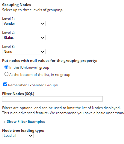
Adding multiple 'Nodes' widgets into the same page and using 'Filter Nodes (SQL)' to show different type of nodes are also commonly used. e.g. one widget would be used to show Down nodes only (status=2), another to show devices in branch A (assign custom property 'Branch' to nodes and filter by Branch = 'A'), or combine multiple conditions together status<>1 and branch='B'
Maps:
Network Map
This is still displayed as default mapping widget in v2020.2.5. If there are still maps created in Network Atlas, this would be the widget to
display a map. If not, this widget could be removed.
Orion Map
This is not displayed by default. Users need to click the pencil icon (top left corner), then add widgets (top right corner) and search for
Orion Map. Drag and drop that widget to a suitable position and select one from the list of existing orion maps.
Worldwide Map
Similar to above, users need to add them manually. This is useful for users need to know device status over large
Geo expansions (e.g. in different states, global setup) or wide/remote areas (e.g. school campus/buildings,
ports/airports, mining area). It could leverage location (via snmp, street, city, country) or GPS coordinates (custom
properties) to automatically place nodes on the map.
Note: Internet connection is required to the Map provider (http://open.mapquestapi.com).
Sometimes the map could be too large to fit in with other widgets. Instead of moving other widgets around/away,
the workaround would be creating a sub tab and only display the maps there.
This can then be used as NOC page and rotate every few seconds/minutes.
New features/Thwack resources
These were more to highlight new functions/enhancements/shared contents which users may not be aware of.
In most cases, these can be removed to save space.
Event Summary/ Last xx Events/ Last xx Audit Events
These are usually 'Nice To Have' and users can change the number of events displayed or remove them
Individual module's summary
These are 'Nice To Have' widgets too. Users can also add additional per product widgets into summary page too.
Add Widgets
Additional widgets can be added into summary page to provide a quick overview and highlight issues, such as 'top xx' widgets. Just to be minded that Orion has multiple types of pages (views) such as Summary, Node Details, Virtualization, and so there are widgets only available for certain view type.
A few commonly used widgets are:
Top 10 Nodes by xx, Top 10 Components/Monitored Processes by xx, Custom chart, Custom object resource (classic), Custom HTML, xx Capacity Forecast
Some advanced widgets would be Perfstack projects, Netpath status, Custom HTML, Custom SWQL.
Account/View limitation
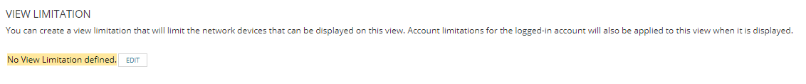
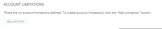
Instead of creating multiple pages for different users, account/view limitation can automatically filter the information to be displayed on a page. This works on most of the 'modern/new' widgets, but some classic widgets or custom xx widgets do not inherit the limitations.
Custom Menu
Sometimes an existing page may not meet specific requirement of a user (e.g. IT Helpdesk, department user, outside contractor), then use
a customized view only for that user account might be more appropriate.
Frist, create a view with desired resources and then create a new menu bar and only include the new view. Finally, edit the account and
change the home menu to the new one and disable other products' menu.
External web pages can also be added into existing menu bar. Simply add an additional web page link to menu bar and configure the url.
Note, some external pages do not allow redirect visit, so it may ended up with an error or empty page when browse in Orion web console.
Starting from here, let's discuss something requires a little more hands on experience of the products.
Appstack
Users can access it via My Dashboard-> Home -> Environment and it is the best way to show overall monitored system's health status and dependencies. Instead of showing everything and clicking around to find the problematic objects, users can further customize this with filters from left and then save the new layout.


The exact categories and products mapping can be found in this KB and Vman is the 'Key' to link application performance to storage performance in virtual environments.
Perfstack
After understanding the dependencies and impacts of an issue from Appstack, Perfstack is usually the next place to pull statistics together and perform your analysis. The starting point is always the object (node, interface, application, etc.) causing problem and simply click to start building an Analysis project.

Some critical metrics and its direct dependencies will be added automatically. Hove over the mouse at spikes/event time to view data. Additional metrics can also be added (drag and drop) to support the analysis.
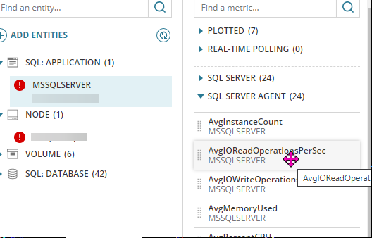
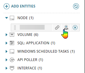
Use 'Add Entities' button at top to manually add objects or click the second button next to an object to add all its related entities into a project for further analysis.
In below example, the root cause of our web portal down was highly possible due to Randy's change in IIS config.
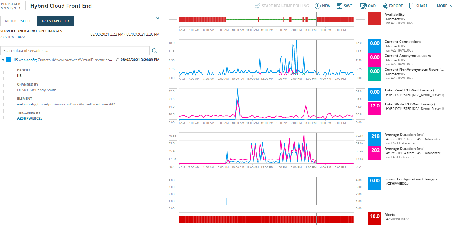
If users like a created project layout, they can save this analysis project and reload it easily next time or reuse that in custom widgets and modern dashboards.
Modern Dashboard - CXO Dashboard
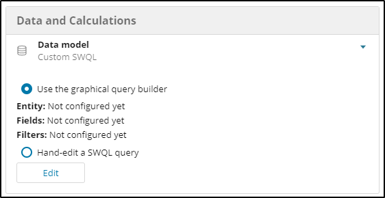
This is the new way to show high level summary and well suited for management level users. However, to use this, users need SWQL knowledge for most of the cases. The only exception is to display existing Perfstack projects. Some screenshots and explanation were taken from @tony.johnson.
1. The Table widget is designed to display tabular data.
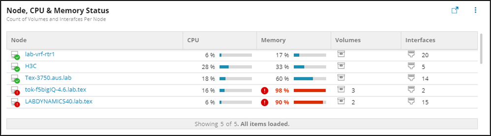
To generate a widget like above, SWQL would be the direct way, but Orion also provides a graphical query builder that can help new users.
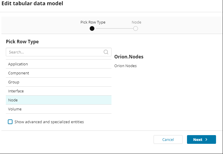
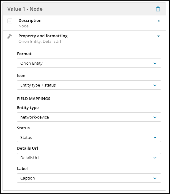
Choose the Node for the row type.
Select the check box "Show advanced and specialized entities".
Drag Caption, Status, DetailsUrl, CPULoad, PerecentMemoryUsed, Volumes.Caption, Interfaces.Caption.
The Orion Nodes entity has a 1:Many relationship with both Interfaces and volumes, the query builder allows you to aggregate the rows to provide Count, Min, Max, Average aggregations.
Save the Data Model
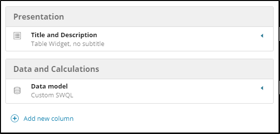
Choose which columns will be displayed in the table, click add new column
Each Column has 2 configuration elements.
Description
Property & Formatting
Define the description for the field such as 'Node' and expand the Property and formatting panel. Here you can choose from a section of preconfigured formatters. For the node column, use Orion Entity. This presents additional field mappings. Status, DetailsUrl and Label all match back to columns selected in the query builder. The Entity type is the icon of your choice from the supplied list.
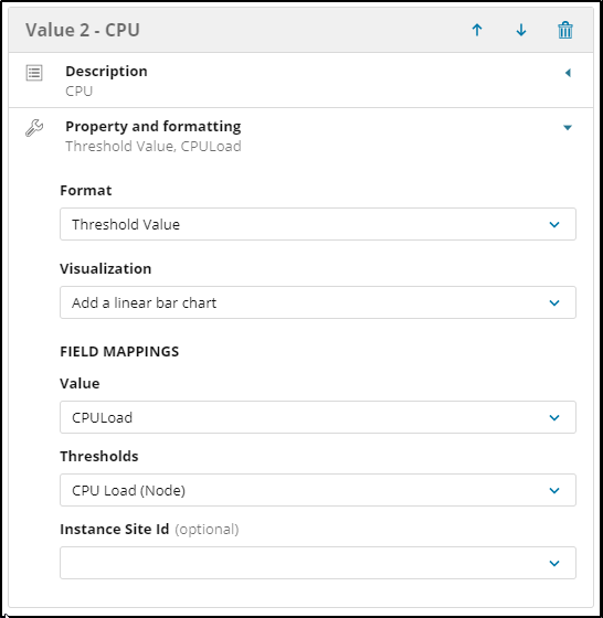
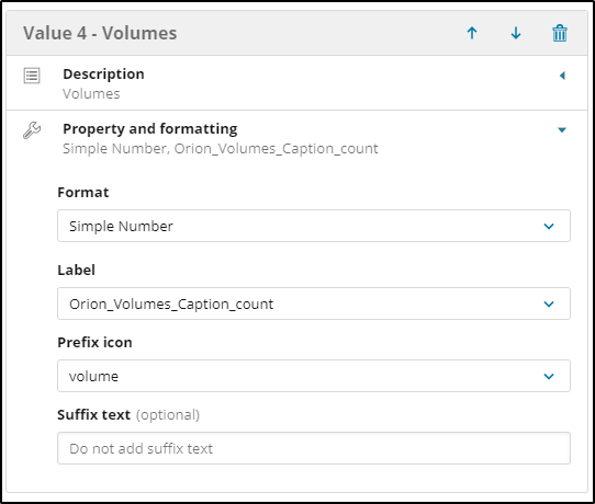
The CPU and Memory Columns use a 'Threshold Value' for the format. There are many threshold formats available based on Orion thresholds for the metric such as response time, packet loss, IOPS, Interface Utilization and many more. The Interface and Volume Count Fields both use a Simple Number Formatter.
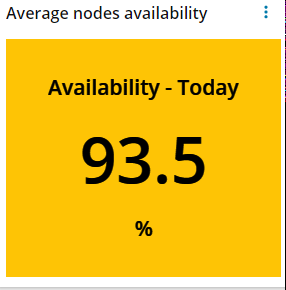
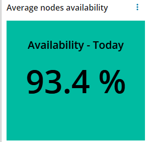
2. The KPI Widget will show Big Number in tiles. You can add multiple KPI cells to an individual KPI widget, select a default background color, and also warning and critical thresholds applied to the observed values.
Here is an example query to get show all nodes' average availability for today.
SELECT round(avg(Availability), 1) as avgavil FROM Orion.ResponseTime
where daydiff(tolocal(datetime), getdate())=0
Configure related thresholds and the tile will change color (orange for warning and red of critical) accordingly.

If the KPI unit is also important, 'concat' operation can be used to display special unit or characters next to the number. Note, thresholds will not be working in this scenario.
SELECT concat(round(avg(Availability), 1), ' %' ) as avgavil FROM Orion.ResponseTime
where daydiff(tolocal(datetime), getdate())=0
3. The Proportional Chart allows you to choose from 4 subtypes:
Pie Chart
Donut Chart
Horizontal Bar
Vertical Bar
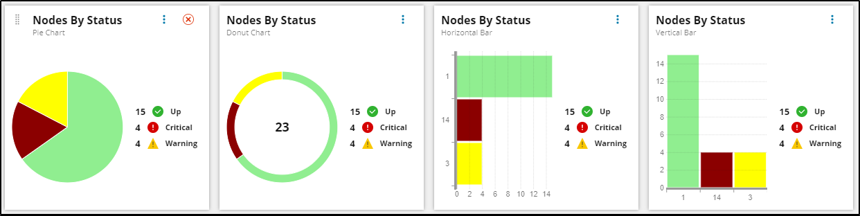
The Data models for proportional charts require two fields, one must be numerical, the other is used as a grouping. The proportional chart can map the status values returned by the query to meaningful text and will show these in the legend.