We are trying to setup a Chart on the web Report Writer that shows Machine Types and IOS versions for specifc devices. However, we have not yet found a chart on the Report Writer that can do this. Any ideas?
Or we can try this chart:
1) add "Custom Chart" resource into Report
2) as data source use Advanced DataBase Query (SQL, SWQL)
3) Check "SQL" query type
4) Use following query:
SELECT N.MachineType, DD.Date, SUM (CASE WHEN Mult = 0 THEN -1 ELSE 1 END) AS Count
FROM Nodes N
-- ${ToTime} - bug has to be there
cross join (
SELECT DATEADD(mi,-30, GETDATE()) AS Date, 0 as Mult
UNION all
SELECT GETDATE() AS Date, 1 as Mult
UNION ALL
SELECT DATEADD(mi,30, GETDATE()) AS Date, 0 as Mult
) AS DD
GROUP BY MachineType, DD.Date, DD.Mult
ORDER BY DD.Date
5) Go to Edit chat page
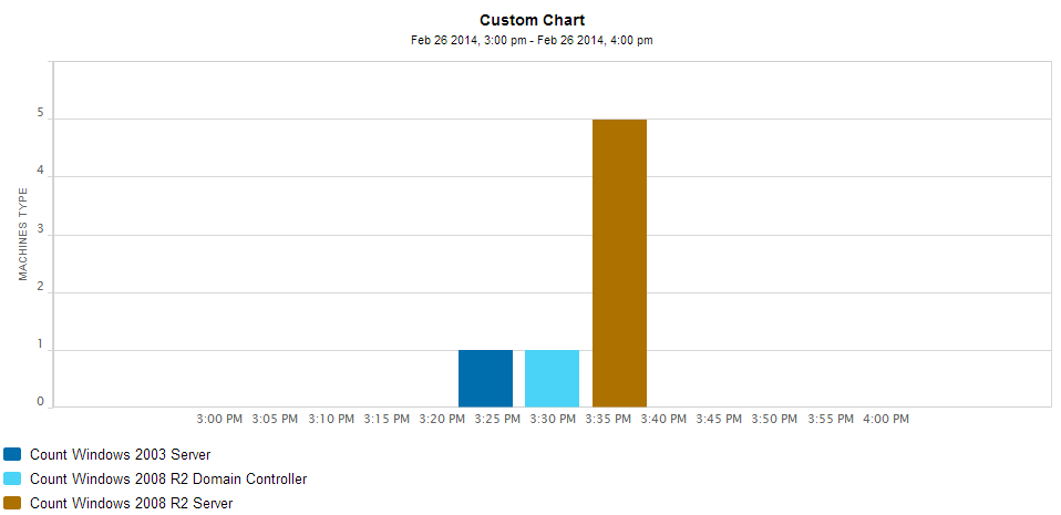
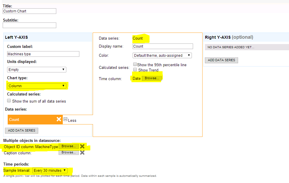
6) Set chart type: Column
7) Add data series, Select "Count" field, and set "Date" field as Time column, see picture.
8) Select "MachineType" field in option: "Object ID column"
9) Sample interval set to 30 minutes.
Are you looking for a chart or a list?
I am trying to get a chart. I haven't had any luck so far.
A chart for this? Do you mean some type of histogram chart (Bar, Pie) ?
Unfortunately this is not possible in Report Chart Resource. We allow only chart which has datetime on x-axis . It means historical charts with data as datetime1:value1, datetime2:value2, ....
Please create customer feature request for it.