Hello all,
I am currently trying to graph within NPM the data points obtained from a custom SQL query. The query returns the data seen below; I would like to take the data from the "SQLProcessUtilization" column and graph it on a line chart. I just haven't been able to figure out how to designate which data column to use when configuring a Custom Chart within my NPM view.
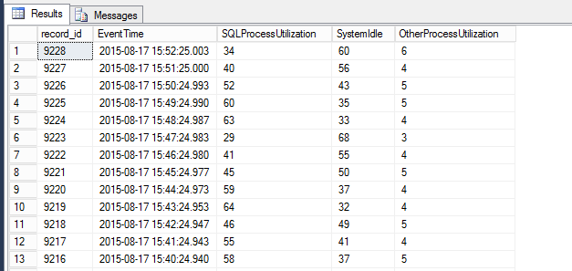
Here is the query I am using to extract the data...
declare @ts_now bigint
select @ts_now = cpu_ticks / (cpu_ticks/ms_ticks) from sys.dm_os_sys_info;
select record_id,
dateadd(ms, -1 * (@ts_now - [timestamp]), GetDate()) as EventTime,
SQLProcessUtilization,
SystemIdle,
100 - SystemIdle - SQLProcessUtilization as OtherProcessUtilization
from (
select
record.value('(./Record/@id)[1]';, 'int') as record_id,
record.value('(./Record/SchedulerMonitorEvent/SystemHealth/SystemIdle)[1]', 'int') as SystemIdle,
record.value('(./Record/SchedulerMonitorEvent/SystemHealth/ProcessUtilization)[1]', 'int') as SQLProcessUtilization,
timestamp
from (
select timestamp, convert(xml, record) as record
from sys.dm_os_ring_buffers
where ring_buffer_type = N'RING_BUFFER_SCHEDULER_MONITOR'
and record like '%<SystemHealth>%') as x
) as y
order by record_id desc
Thanks, MC