Hi all,
Being able to run IP SLA operations from different sites to a central site is great in order to scope performance and also availability.
The availability bit is what I am trying to get into a report, but preferably a chart, to display on a summary page.
I have 40 odd sites that are all connected to a central site. All 40 sites are expected to have an 100% availability and IP SLA operations have been configured bi-directionally on core and remote sites.
I know when a site is unreachable, and that is when the operation to that site is down (reachability). What I need to do is combine all the down operation events, the time stamp for that event and translate it into percent.
That way I'd know when a site has been unreachable, what the availability percent of that site was last month and ultimately, get insight as to why the site was unreachable (ISP, operating Node etc). Obviously, I don't want the availability to be based on Orion's ability to ping the remote sites.
I wish to have charts for ALL the sites (a line chart would be great) so that I can get a perspective of availability from core to remote sites and vice versa.
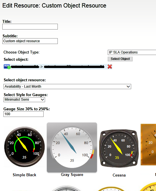
So far I've built a few resources in an attempt to get the data I am after. The closest I could get to the raw data I am after is by using the Custom Object Resource, where Object Type is IP SLA Operations, the selected object is an operation, and the Select Object Resource is Availability - Last Month.
With this setup I get a gauge which provides availability percent but is this the availability of the source node, based on ping by Orion? Or is it the availability of the Up status returned by the IP SLA Operation??
This is what I end up with:
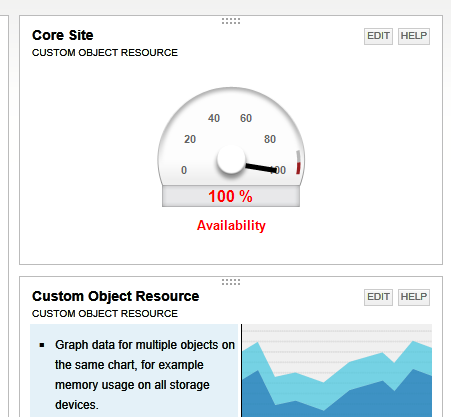
In short, what I need is the operation source availability in percent for last month, based on operation status.
To avoid the use of 40+ Custom Object Resources on a single page, it would be great if I could present the data in a chart.
Is this possible?
Thanks for reading,
Deltona