Hey everyone!
I have no clue how to properly describe this problem. The last couple of weeks, I've been working on adding our MS SQL instances into Orion, which has greatly increased the amount of data we are collecting thanks to AppInsight. However, the "at a glance" reading seems more difficult than it should be.
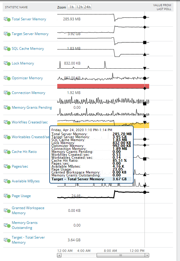
Has anyone ever seen an issue where your line graphs are shifted with relation to the numerical values and the warning/critical areas?
At first I thought this was just an issue with Firefox, but I'm noticing I'm seeing it on Chrome as well.
Here's an example of one of our widgets. Notice how the bottom few fields do not have any line bars next to them, because all of them have been shifted upwards.