Hi,
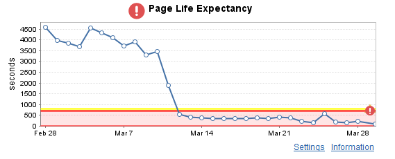
On all my custom application the Min/Max Average Statistc Data is called % Processor Time. It is still listing the values from the collected stat with the correct Warning/Crit thresholds. This is only a cosmetic issue but is confusing some of our users.
Has anyone seen this before? Is there a way to get the Graph title to represent what its graphing as oppsoed to % Processor Time..
You can see from the image below that this montioring is looking the count of messages in a MSMQ queue. This is a custom Powershell Monitor. and the graph is showing the correct statistic but the title is % Proessor Time.