Hello,
Does anyone know of a way to edit the horizontal and vertical dimensions for the graphs displayed on both the Node Details (think Latency & Packet Loss) and Interface Details (Percent Utilization, Errors/discards, etc.)?
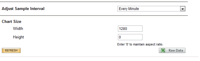
We currently have quite a few charts for each view and it's a lot easier to view the graphs at smaller dimensions than what the service automatically renders them to. Something around the 1200 x 380 mark would be ideal.
I did cheat a little bit and replace the 'Latency & Packet Loss' graph with a custom HTML resource. Within, I added the following code:
<html>
<body>
<div style="width: 1200px; text-align:center; padding:1px; padding-bottom:1px; ">
<img src="" id="graphs"/>
</div>
<script type="text/javascript">
function gup( name )
{
name = name.replace(/[\[]/,"\\\[").replace(/[\]]/,"\\\]");
var regexS = "[\\?&]"+name+"=([^&#]*)";
var regex = new RegExp( regexS );
var results = regex.exec( window.location.href );
if( results == null )
return "";
else
return results[1];
}
var geturl_param = gup( 'NetObject' );
var GETURL_FINAL = geturl_param.toString();
</script>
</body>
</html>
While I understand this is a flawed approach, it has helped to size the graph the way I'd like. Basically I get the NodeID from the current URL, toss it in a variable and use that variable to generate a URL that links to the graph image.
I cannot use this approach for other graphs, namely ones that are tied to custom pollers. There are several nodes being monitored that use a handful of customer pollers, and each of them has different interfaces that need to be graphed. (Some are active, some are inactive - it varies across the board.)
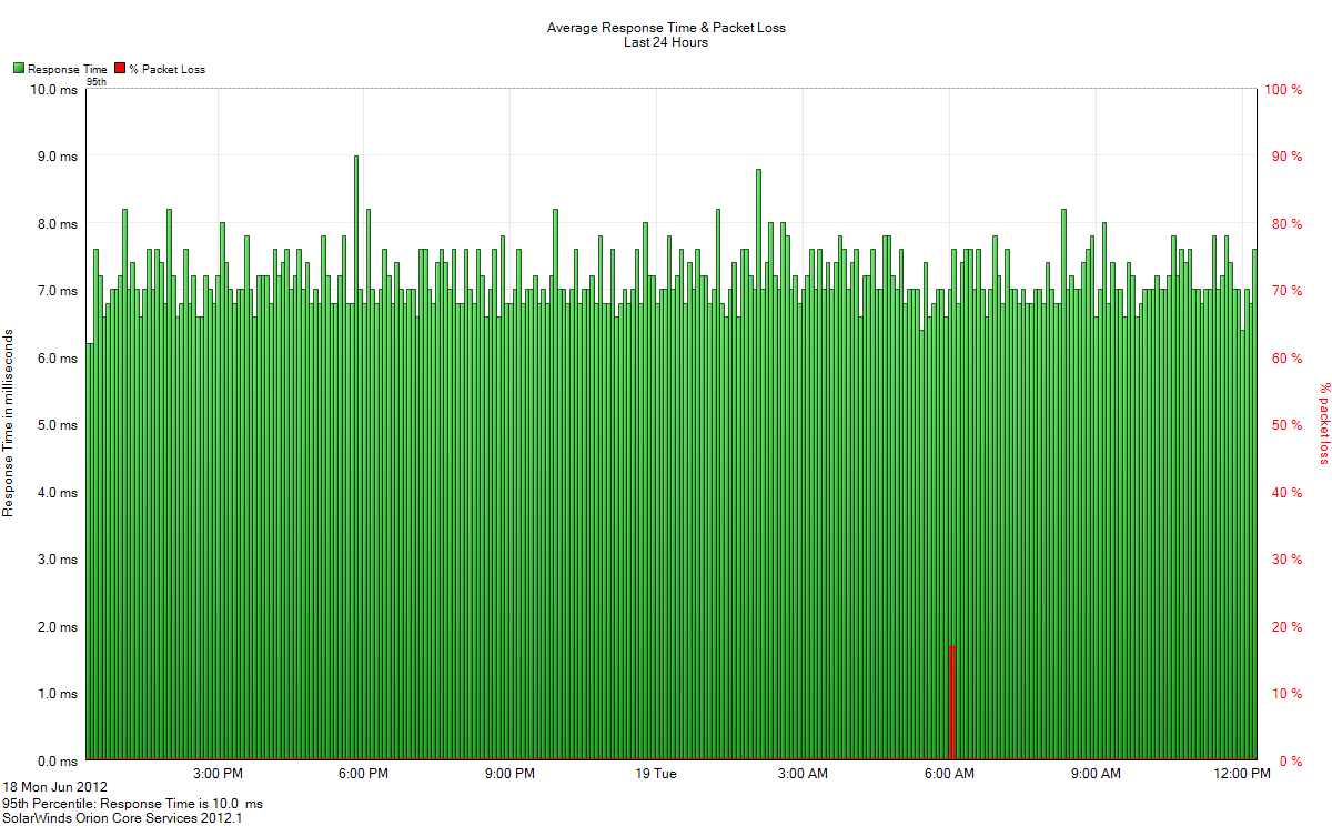
Here is an original 'Latency & Packet Loss' graph:
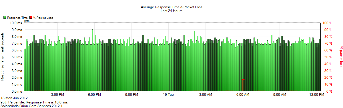
Here is the same graph custom-sized through the above script:
Please tell me there is an easier way to do this...
Regards,
JS