Tasked with creating a Dashboard for our top level Executives. Need suggestions on what are good Graphs or Charts (no data, just pictures) that are meaningful to a CIO type Exec.
Examples would be helpful.
Thanks
Oh my, Solarwinds makes it so very easy to make you look so very GREAT! Take a minute and thing about what matters for the big guys! Looks are everything. I copied a couple of shots below - start big, then drill down into your environment - capture stats that matter, Solarwinds presents the "pictures" I need to tend to a couple of nodes in my environment, all GREEN should be your goal to present. GREEN is a color that matters.
Hope this helps... every snip from Solarwinds is indeed a PICTURE!
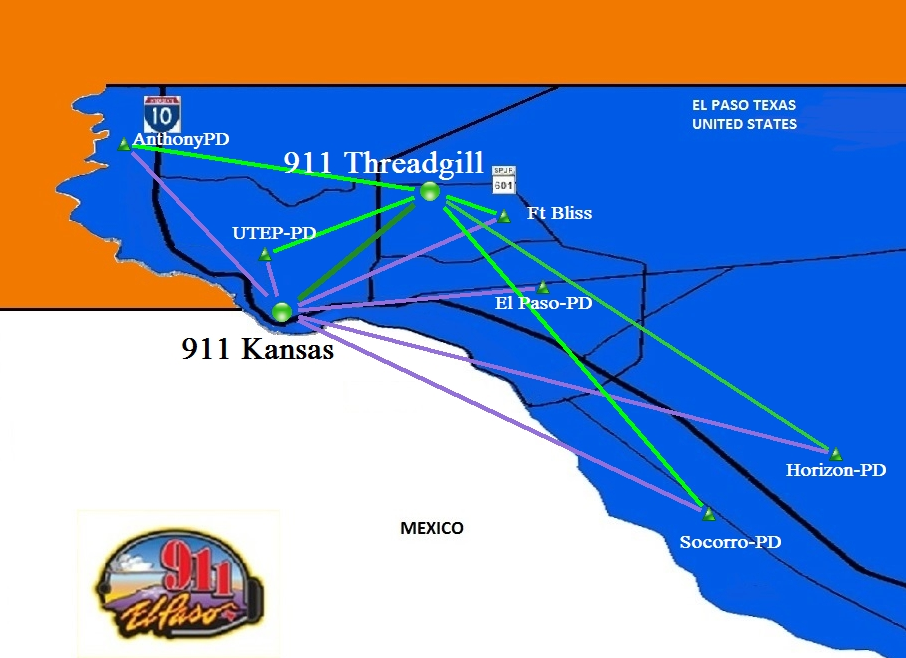
Do you use the Network Atlas Map - you can show how you monitor the sites from the object groups!
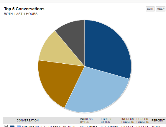
NetFlow Conversations are pretty too:
Raw Statistical bar graph:
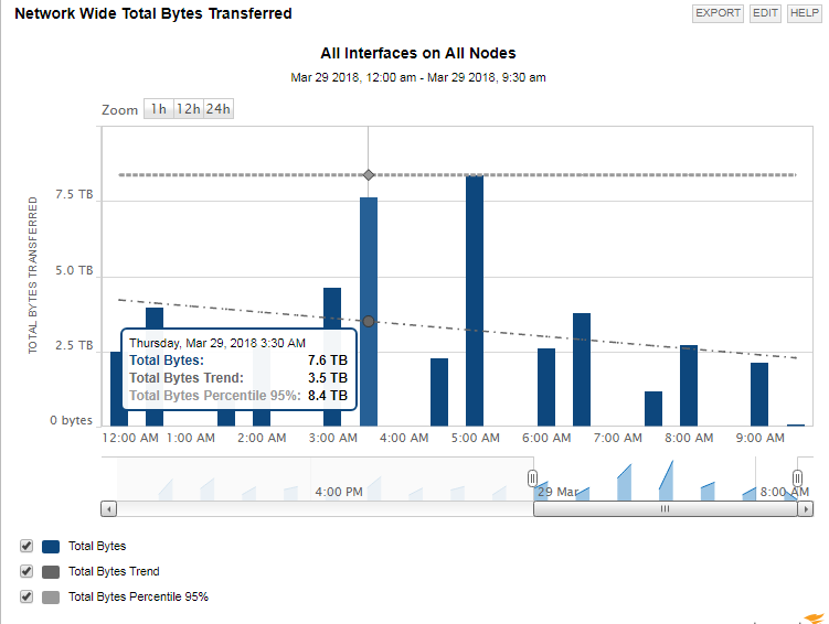
Network - Transferred Data:
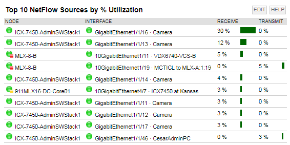
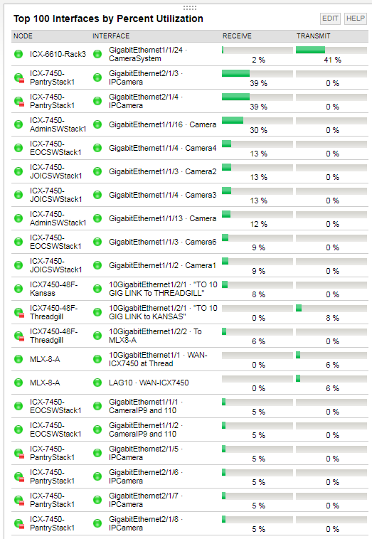
Network - Interfaces by Utilization:
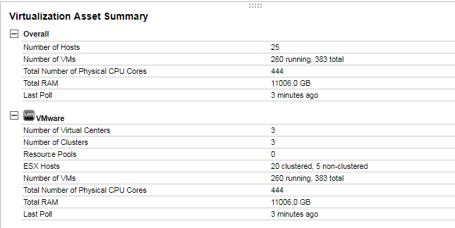
VM Ware Statistics:
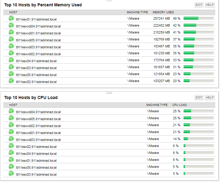
Memory and CPU in the Virtual Environment: