I could not understand the drill-down of DPA .
In many cases I see wait time chart with a specific value ( e.g : 4000 ) but when I click on the chart the new chart is not match with .
This is one example :
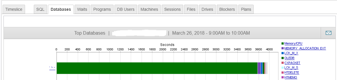
( Total wait time is near 4000 seconds )
When I clicked on green bar , I saw the following chart :
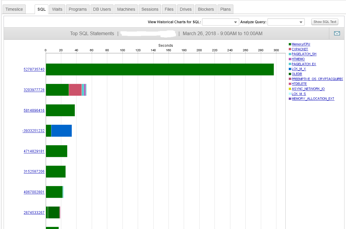
If you add all the wait times of all bars in the second chart it does not match with first one ( 4000 Seconds ).