I've been experimenting with the Custom Chart and Multiple Object Chart widgets in NPM to monitor multiple interfaces and their max transmit/receive utilization. Everything is working well, except there's a discrepancy in the data displayed between these two widgets despite monitoring, in theory, the same data. Here's a series of screenshots that should make things clearer.
Below is a Custom Chart set up to monitor the max transmit bps of 10 interfaces. These interfaces are selected as Specific Objects (static selection) in the data source, and each interface is set to collect detailed statistics every 1 minute. Note the 8.7 Gbps peak transmit bps given as the Sum value at 2:26 - 2:27 AM:
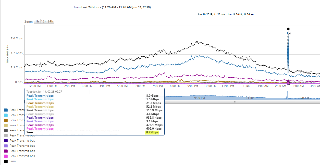
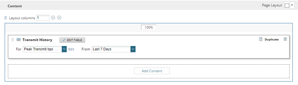
The peak sum value of 8.7 Gbps at 2.26 - 2.27 AM lines up exactly with the data given an equivalent report, so everything looks great so far:
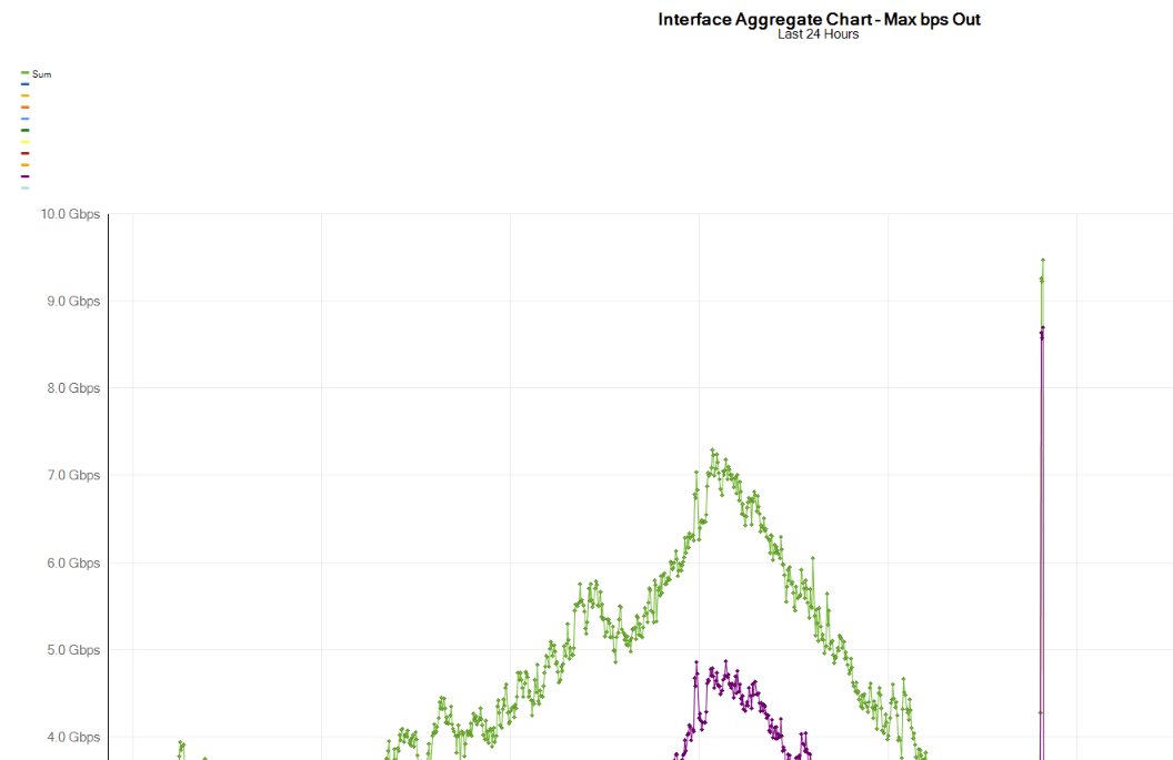
The discrepancy comes in when I make a Multiple Object Chart and monitor the same 10 interfaces. I'm using the option "Select specific interfaces" within the widget, and the output shows a peak sum of 9.4 Gbps at 2:26 AM. I was able to use the "Export to Excel" feature to grab the exact bps data. Both the Custom Graph and the report shown above return a value of 8.6 Gbps at 2:26 AM. The one thing that I can think might be causing this is that the Multiple Object Chart is using the "Max bps Out" option from the "Select a Chart" drop-down, as there isn't an option for Peak Transmit bps. Is this thinking correct? If I'm specifically interested in the peak transmit bps rate, would it be more reliable to use the output from the Custom Graph and report shown above?