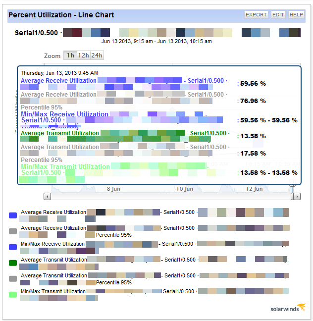
Please try and make the new hover feature in the new charts in NPM less intrusive. Here's what ours look like: (We can't even see the line graph when we hover over it)
When I recently talked to some of the folks over at SolarWinds they indicated that they were aware of this issue and were planning to work on it.
Awesome. Thanks for the information.
We now have even newer charts in NPM 12.2 that have different types of popovers