Not sure if this is the right spot to put this in but.....
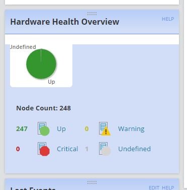
The graphic design needs fixed for npm 12. The U on undefined is always cut off if you choose a color theme. Also The Up, Critical, Warning, and Undefined can be pretty difficult to see depending on the color themes. Steel Blue and so on make it extremely difficult to see undefined and warning. There are also other theme problems, npm 12 needs some color adjustments based on themes, thank you.
And could we possibly have a black theme? Where the top borders are black but the box itself is white?