Have recently upgraded to NPM 12.1, and though there are some wonderful new features (hello, PerfStack!), the UI change (fonts, table layouts, etc.) has exacerbated an existing limitation in the UI:
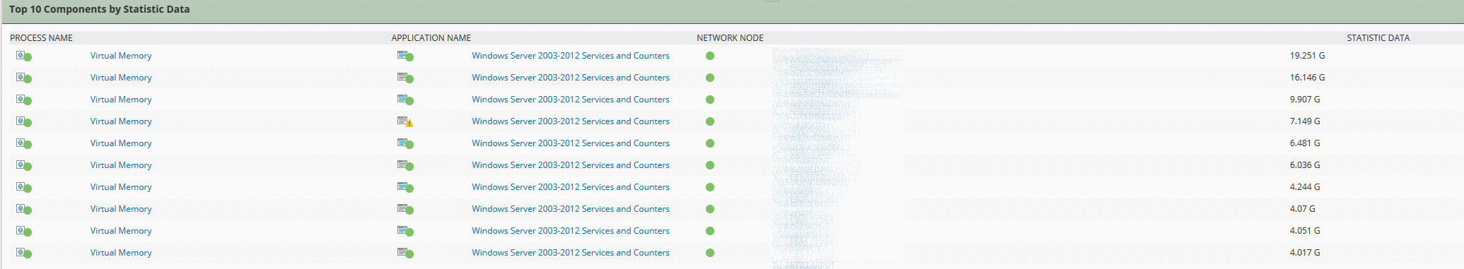
In order to get long strings of words to fit on one row without word wrapping, the total stretched column ends up containing a huge amount of negative space between sub-columns, as shown in this example from a Top10 page -
I found that the global control of this is in the
.ResourceWrapper,
.ResourceWrapper table
{
width: 100%;
}
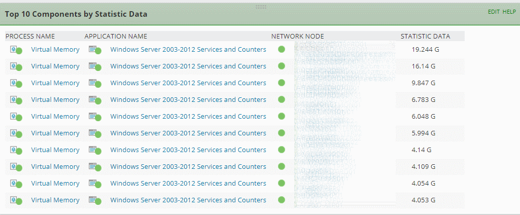
section of the C:\inetpub\SolarWinds\Orion\styles\Resources.css file.By adding the CSS property white-space: nowrap; and changing the width to 1% in that section, I can get the table to condense to a more manageable look -
.ResourceWrapper,
.ResourceWrapper table
{
width: 1%;
white-space: nowrap;
}
but this creates issues with other tables on other pages (e.g. the Search Nodes table on the main page), since this is a widely used CSS style element.
What's really needed is a way to manually adjust individual columns within any table
One easy way to do this would be to add in the free colResizable JQuery plugin to the Javascript resources, then reference it in the HTML so that any table resource would include this feature. Not sure how to do this (and don't want to break anything), but would love the UI team to address this.I entered a recent support ticket around this issue, Case 1201132.
Ultimately, we really need much more flexibility in the overall UI design. Multiple columns are better than one or two, and left-hand navigation tabs also help, but a grid or tile design would go much further towards allowing us to create better executive dashboards and NOC views. Oh, and also Orion Dark Theme Option!
Thanks,
Chris