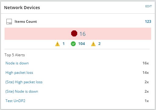
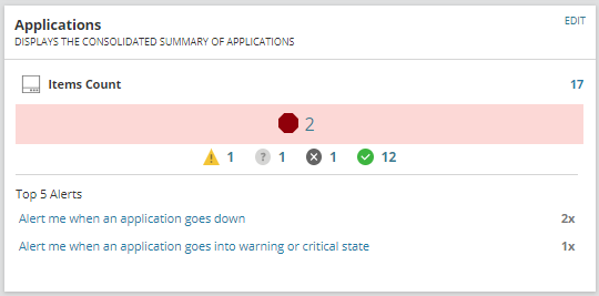
My colleagues and I think it would be great if we could have customizable pie charts, like the Application Health Overview, and set them for specific applications, ie. Exchange, AD, SQL, etc., and either change the title or give it subtitles to differentiate them on the same page. I know you can limit the view of Application Health Overview chart via the customize page, but I would like to have several of these on a page to display on one screen.
I think a lot more pie charts overall would be a good thing as well as a way of comparing, for example, the amount of nodes down compared to nodes up.