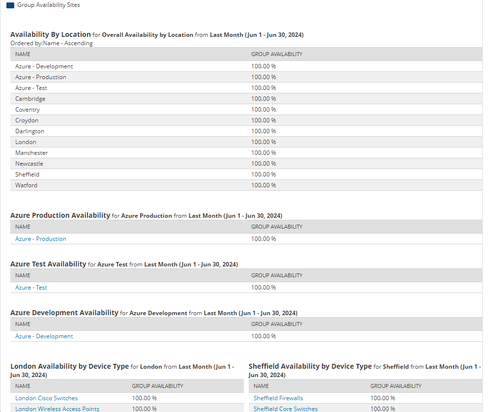
Please could we have Pie Charts for reporting on Group Availability in reports, similar to the Node Availability pie charts.
We report to our senior stake holders on a Group Availability basis but at the moment the report is just a large amount of tables. It would be much better if it could be graphically represented with Pie Charts giving an availability that our stake holders can just glance at rather than having to look through tables of data. The Availability below would be much better displayed as Pie Charts.