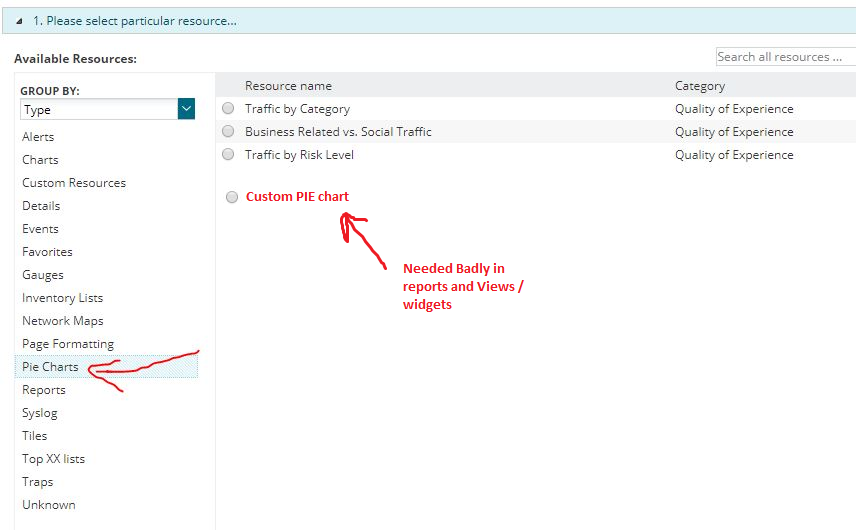
We would like to be able to display custom pie charts. For example, show the status of all my servers with custom property of 'critical' in a pie chart with a standard red/yellow/green code. Or all equipment with custom property 'exchange', etc.
Does anyone know what is the status on this? I really need this feature or let me know how to create one using SQL Server query. Thanks!
General functionality to create my own pie charts would be great. Lists get too long for the overview page, but a pie chart would be a great use of space (and it wouldn't dynamically change size).
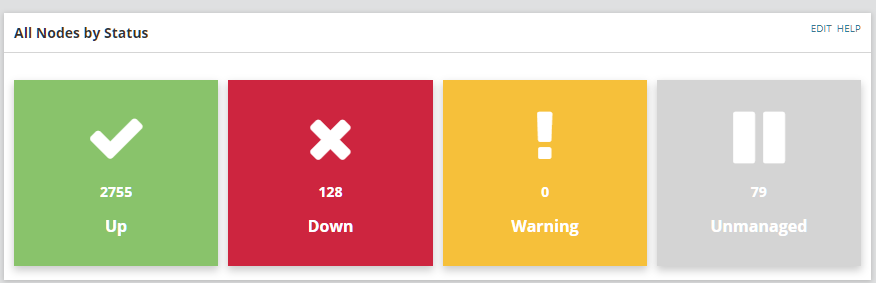
If not the general functionality, then at least a All Nodes by Status chart would be nice.
just find a workaround Integrate Google Charts with Solarwinds reports/view, A Pie chart example
Just bumping this as I also would like this feature.
This is very basic need for Reporting and I am amazed to see SolarWinds missed it ... Hope it will be there soon we have ability for charts & tables.
Really appreciate to have ability to add custom pie charts.
Time now for Solarwinds to put up amazing Charts, Dashboards and Views ..
Use of Material UI..
Mobile friendly pages..
Bump
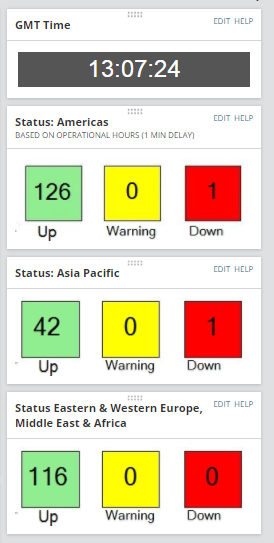
i would have really loved this recently something simple to see total devices up/down similar to the NCM/ NTA pie charts.
i couldn't get the pie chart so had to opt for this type of view
How did you get the text to be live, as in im guessing that count 126 will change if something goes down? How was that done?
Hi, how to create this type of Dashboard. Kindly let me know as as mentioned I LIKE EGGS
HI selvakumaran.l apologies for the delay,
I have written up an article here: Operation hours Alerting | Map Syncing | RAG Status Workflow on how I achieved this
originally from this article
Scoreboard
bump
NPM 12.5 going to be out and still basic thing missing, come on SolarWinds we need this "Custom Pie Chart" while creating views / reports it becoming very important requested FR from most customers.
It is such a surprise that despite being a feature request since last 5 years, we still don't have the pie chart functionality. Most of the CIOs just prefer seeing the red-green-yellow beautiful dashboards that make it much easier for them to understand. Currently we use some SQL queries to get the job done, but in the words of a customer,"It really doesn't look that pretty."
So many customizations and workarounds have been provided by people, which work in some environments, and not for others. We really need these customizations to become part of the package, as many customers do not allow us to do anything which is not part of the default set of SolarWinds.
Maybe need to include Product Manager so this can be in NPM 12.5.xxx
cobrien
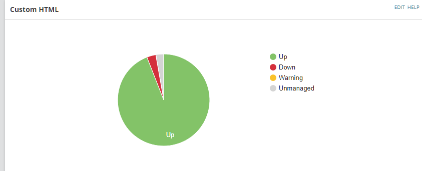
I did something similar using some HTML + CSS.
If anyone is interested I'll post the code.
You can create a Custom HTML view and create a pie chart using JS and the Google chart library (or any for that matter).
For example:
<html>
<head>
<script type="text/javascript" src="https://www.gstatic.com/charts/loader.js"></script>
<script type="text/javascript">
var swql="Select Count(n.status) AS Cnt,s.StatusName FROM Orion.Nodes n RIGHT Join Orion.StatusInfo s ON n.Status = s.StatusID WHERE s.StatusID IN (1,2,3,9) GROUP By n.Status,s.StatusName,s.StatusId ORDER By s.statusID ASC "
var params = JSON.stringify({
query: swql,
parameters: {
}
});
$.ajax({
type: 'POST',
url: '/Orion/Services/Information.asmx/QueryWithParameters',
data: params,
contentType: "application/json; charset=utf-8",
dataType: "json",
success: function(response) {
console.log(response.d.Rows);
google.charts.load("current", {packages:["corechart"]});
google.charts.setOnLoadCallback(drawChart);
function drawChart() {
var dataTable = new google.visualization.DataTable();
dataTable.addColumn({ type: 'string', id: 'Servername' });
dataTable.addColumn({ type: 'number', id: 'Count' });
for(var i=0; i < response.d.Rows.length; i++){
var row = [response.d.Rows[i][1],response.d.Rows[i][0]];
dataTable.addRow(row);
var options = {
pieSliceText: 'label',
tooltip: { text: 'value' },
is3D: false,
sliceVisibilityThreshold : 0,
slices: {
0: { color: '#83C368' },
1: { color: '#D4303C' },
2: { color: '#FAC22A' },
3: { color: '#D4D4D4' }
};
var chart = new google.visualization.PieChart(document.getElementById('donutchart'));
chart.draw(dataTable , options);
})
</script>
</head>
<body>
<div id="donutchart" style="width: 850px; height: 300px;"></div>
</body>
</html>
Will give you this :
Exactly! This is why the higher ups are in the process of making us switch monitoring suites. SolarWinds lacks many basics that could really make everything much better. A good portion of what we do on SolarWinds is a workaround of some sort.
Hello
Can any one share script for capacity planning in pie chart. in which i want to show how many machine are in warning state, Critical and at capacity. and at bottom total no of machine
thanks
Sumit Goel
still