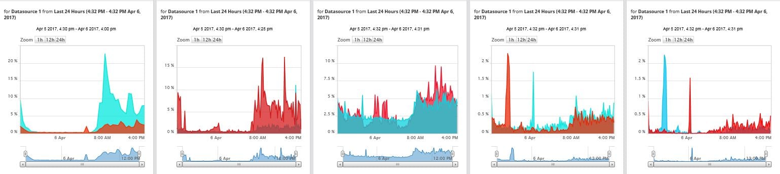
Custom Area Chart with scale which can show 100% on "y" axis, at present when we have multiple interfaces to display as a chart the percentage utilization varies on each & the auto scaling
of the chart adjusts depending on the usage. It would be useful to with one standard "Y" Axis scaling so that when a manager/CIO looks at the chart it is uniform & any interface utilization
increase is reflected.