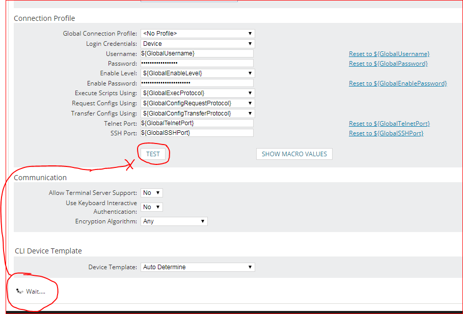
Here's a friendly and gentle request that's hopefully minor and small for you: Would you kindly move NCM's rotating "node-Test-in-progress" graphic (it indicates a test is in progress) from the bottom of the page to the same line as, or just below, its Test button?
The reason is only to improve efficiency. Many times we've added nodes to NPM and then enabled NCM to manage them and then lost time waiting for output of the test. Clicking the NCM Test button for a Node's Connection Profile seems to just sit and do nothing--because the rotating progress graphic doesn't show up within the current screen--it shows up off the bottom of the screen. Sometimes staff who are adding a node just sit and sit, waiting for an indicator of progress, not realizing it doesn't appear next to the Test button, that it doesn't even show up within the same screen without scrolling down.
We've had to train people to scroll to the bottom of the page to see the progress and success or failure. It seems NPM/NCM should show an administrator what's going on without requiring them to remove hands from the keyboard and grab the mouse and scroll down for every Test output. A Time & Motion / Efficiency study dinged that unnecessary movement.
Adjusting the position of that animated progress icon on the web page so it's on the same line as the Test button--or on the very next line down--would keep it within the view and save us that little bit of time. A thousand nodes over sixteen years of NCM use, with forklift upgrades and changes in credentials along the way, means that little bit of time adds up.
It's a little thing, I know. Yet NPM and NCM are so wonderful in so many ways that this less-than-wonderful layout sticks out like a sore thumb.
Thumbs up?
Swift packets!
Rick Schroeder