

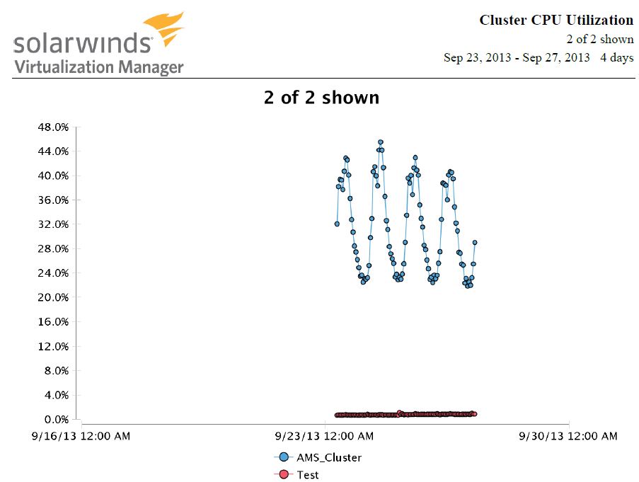
Generated reports from performance dashboard have a strange gaps on the graphs which make it almost usefulness. (see attached)
On the performance dashboard all looks fine, more over when I click on the "graphs" button on the widget, the graphs is OK.
Why I have such gaps on the report's graphics and where i can set the time period for these graphics? On the attached file the graph is for 4 days, where I can correct this?